Color is one of the most powerful tools an artist can use to communicate emotion, energy, and meaning. Whether you’re creating a bold abstract piece or a delicate portrait, your choice of colors can completely transform the mood of your work. But with so many shades, tones, and combinations to choose from, how do you decide which colors are right for your artwork?
Here’s a guide to help you select colors with confidence and intention.
1. Start with the Mood You Want to Create
Colors are deeply tied to emotions. Before picking up your brush or opening your digital palette, ask yourself: How do I want people to feel when they see this piece?
- Warm colors (reds, oranges, yellows) often bring energy, excitement, and warmth.
- Cool colors (blues, greens, purples) can create calm, relaxation, or mystery.
- Neutral colors (grays, browns, creams) can balance a composition or make vibrant hues stand out.
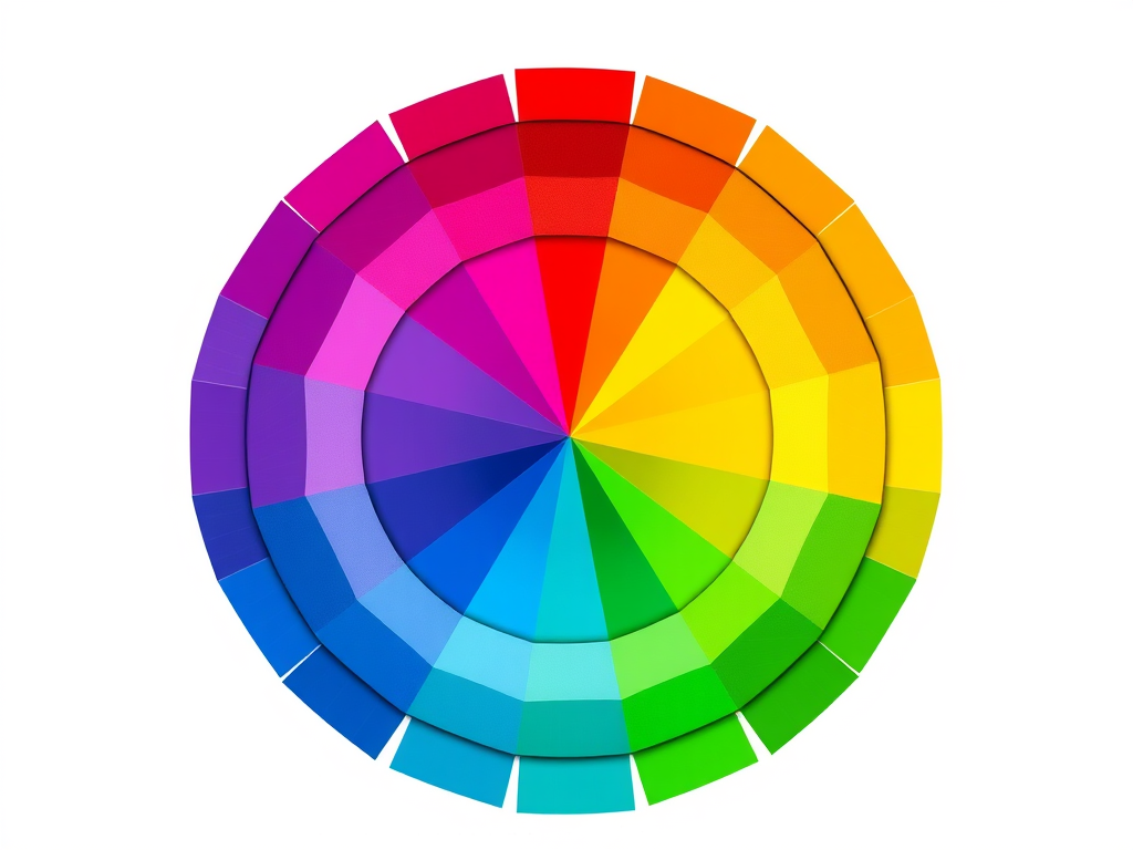
2. Use the Color Wheel as Your Guide
The color wheel is a classic artist’s tool that shows how colors relate to each other. Understanding these relationships can help you make harmonious choices.
- Complementary colors (opposites on the wheel, like blue and orange) create contrast and visual interest.
- Analogous colors (next to each other, like yellow, yellow-green, and green) create harmony and flow.
- Triadic colors (three evenly spaced colors, like red, yellow, and blue) create balance and vibrancy.
3. Pay Attention to Value and Contrast
Color isn’t just about hue—it’s also about value, or how light or dark the color is. Strong contrast can make a subject pop, while low contrast can create softness and unity. Experiment with different values to highlight your focal points and guide the viewer’s eye.
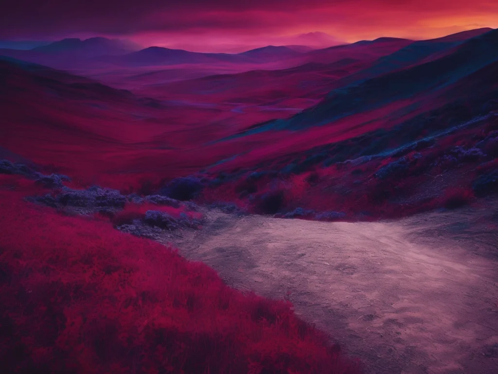
4. Draw Inspiration from Real Life
Nature is one of the best color teachers. Look at sunsets, forests, oceans, and even urban environments for unexpected and beautiful color combinations. Snap photos of inspiring scenes and refer back to them when you’re planning your palette.
5. Experiment and Trust Your Instincts
Sometimes the best color choices come from simply experimenting. Try mixing colors you wouldn’t normally pair, or layer transparent colors for unique effects. Art is as much about feeling as it is about rules—so trust your intuition.
Final Thoughts
Choosing colors for your artwork is a mix of technical knowledge and personal expression. The more you explore color theory and pay attention to the world around you, the more confident you’ll become in your choices. Most importantly, remember that your unique color sense is part of what makes your art yours.
Leave a Reply